Oongawa Design
 Visit our blog
Here is the very simple CSS to remove the background gradient from the Bootstrap 3 carousel.
CSS
.carousel-control.right, .carousel-control.left {
  background-image:none;
}
Published: 2014-04-19 20:30:00 Updated: 2014-04-19 20:30:31
Author: Oongawa Design ( view profile )
And another bit of simple CSS to change the color of the Bootstrap 3 carousel indicators.
CSS
.carousel-indicators li {
  background-color: #669966;
}
.carousel-indicators .active {
  background-color: #FF7600;
}
Published: 2014-04-19 20:29:00 Updated: 2014-04-19 20:29:49
Author: Oongawa Design ( view profile )
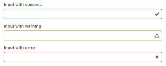
Twitter's Bootstrap 3 provides form validation states that allow for styling error, warning and success states. To use these states, add a .has-error, .has-warning, or .has-success class to the parent element. Any element with a .control-label, .form-control, or .help-block class will receive the validation style. The validation styles are red for errors, tan for warnings, and green for successes.
Bootstrap 3 also allows icons to be added to form elements that contain a .form-control class. This is accomplished by adding adding an element with these three classes: glyphicon, glyphicon-name, and form-control-feedback. Name is the name of the glyphicon, for example, ok, warning-sign, or remove.
<form class="form-horizontal">
    <div class="form-group has-feedback">
        <label for="fname" class="control-label col-md-6">First Name:</label>
        <div class="col-md-6">
            <input type="text" name="fname" id="fname" class="form-control" placeholder="Enter first name" />
            <span class="glyphicon form-control-feedback" id="fname1"></span>
       </div>
    </div>
    <div class="form-group has-feedback">
        <label for="lname" class="control-label col-md-6">Last Name</label>
        <div class="col-md-6">
            <input type="text" name="lname" id="lname" class="form-control" placeholder="Enter last name" />
            <span class="glyphicon form-control-feedback" id="lname1"></span>
        </div>
    </div>
    <button type="submit" class="btn btn-primary">Submit</button>
</form>
Javascript
$('form').validate({
    rules: {
        fname: {
            minlength: 3,
            maxlength: 15,
            required: true
        },
        lname: {
            minlength: 3,
            maxlength: 15,
            required: true
        }
    },
    highlight: function(element) {
        var id_attr = "#" + $( element ).attr("id") + "1";
        $(element).closest('.form-group').removeClass('has-success').addClass('has-error');
        $(id_attr).removeClass('glyphicon-ok').addClass('glyphicon-remove');
    },
    unhighlight: function(element) {
        var id_attr = "#" + $( element ).attr("id") + "1";
        $(element).closest('.form-group').removeClass('has-error').addClass('has-success');
        $(id_attr).removeClass('glyphicon-remove').addClass('glyphicon-ok');
    },
    errorElement: 'span',
        errorClass: 'help-block',
        errorPlacement: function(error, element) {
            if(element.length) {
                error.insertAfter(element);
            } else {
            error.insertAfter(element);
            }
        }
 });
CSSbody {
padding: 20px;
}Published: 2014-03-14 00:30:00 Updated: 2014-03-31 12:34:43
Author: Oongawa Design ( view profile )